The Atlas Paint Building
Category
Feasibility Study, Mixed Use, Multi-Family, ResidentialAbout This Project
-
-
- Mixed Use / Multi Family – 39 units
- 40,000+ Gross Square Feet
- Philadelphia, Pennsylvania
- Adaptive Reuse
- Developer Driven
-
- Feasibility Study
- Schematic Design
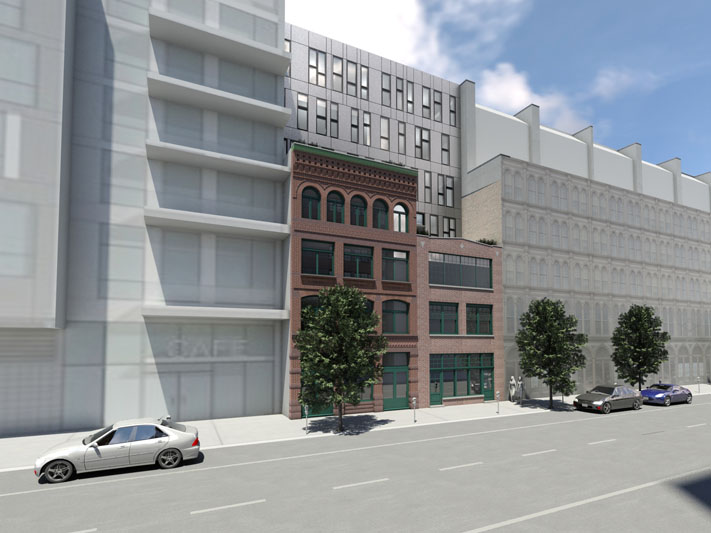
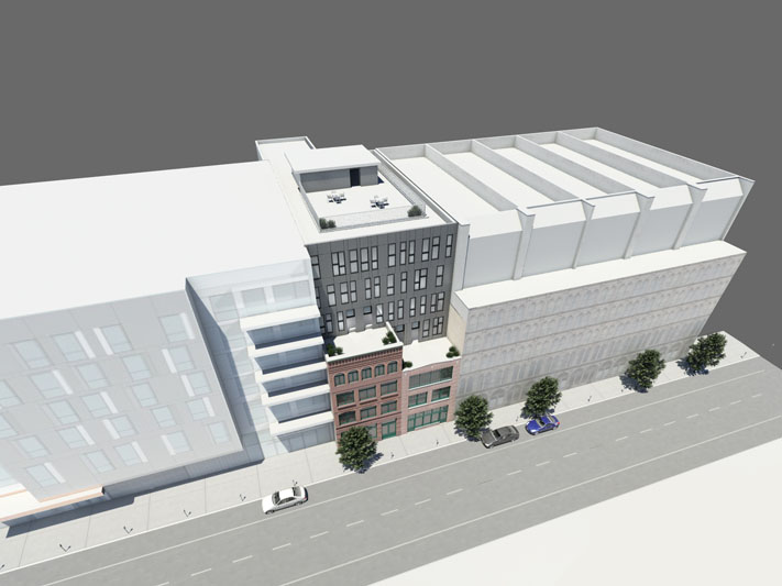
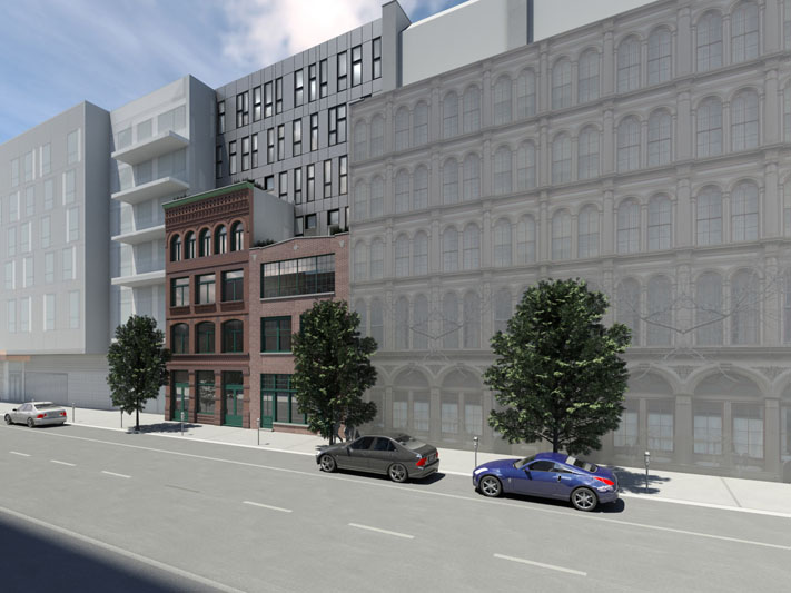
- Renderings
-
The Atlas Paint Building Project began as two vacant buildings in Old City, Philadelphia.
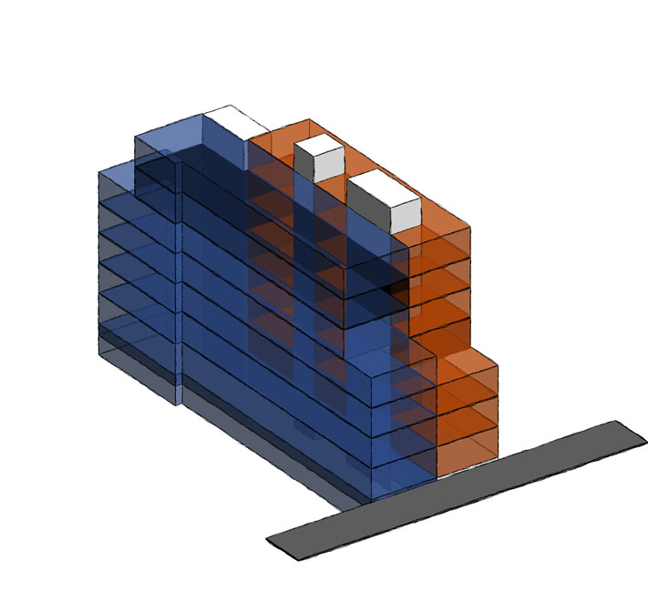
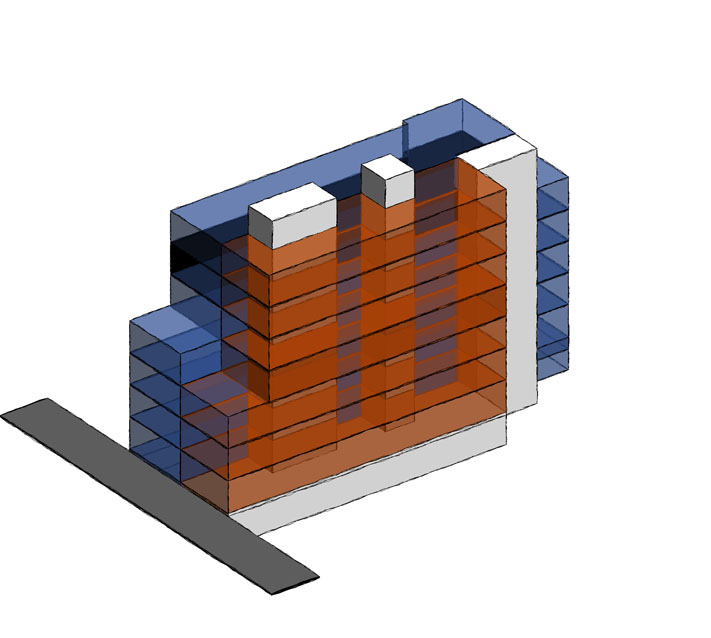
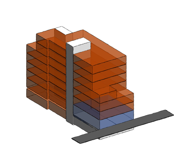
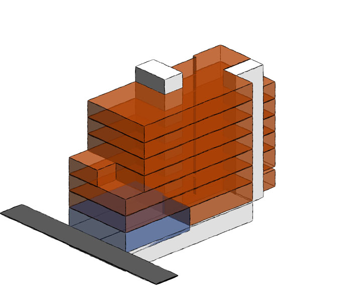
OW3 Architects and our development partners began with a feasibility study to understand the best and most economical way to renovate the two existing buildings. We created design studies that maintained the existing building envelope, as well as design studies that incorporated new construction built on top of the existing building scenarios. We investigated several designs using a blocking and stacking diagram for both the existing building and the built on top options. During our study we agreed upon two concepts to explore further. The first study consisted of a ground floor commercial/retail space fronting the main street with the remainder of the space used for residential units, and the second scenario was a vertical split of the commercial office space and residential units. The orange and blue blocks in the diagrams represent the residential space and commercial space respectively, while the white blocks are for vertical circulation and support spaces. As a result of the two study models we created, we decided to move forward with a renovation of the existing building with new construction built on top, with residential units.
Following the feasibility study, we moved into schematic design, finalizing the building circulation spaces required and unit layouts, then coordinating them with the exterior design. To stay sympathetic to the original architectural features of the building, we envisioned the addition as a backdrop, so the original brick buildings with the horizontally orientated windows would stand out. We stepped the new addition back fifteen feet and clad the addition in a simple gray panel, so the design would not compete with the original brick work. We also used a vertical window motif to help differentiate the new from the old, while making the addition across the two building into one continuous composition.
