Royal Bank – Midtown Branch


Category
Commercial, Feasibility Study, OfficeAbout This Project
-
-
- Tenant Improvement, Commercial
- 3,600± Gross Square Feet
- Philadelphia, Pennsylvania
- Design – Build
-
- Feasibility Study
- Programming
- Schematic Design
- Renderings
-
The tenant improvement project for the Midtown Branch of the Royal Bank aimed to improve efficiency, rebrand the branch, and create a more open and welcoming environment for customers.
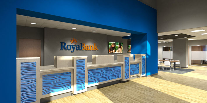
To improve efficiency, the design-build team redesigned the teller line. They carefully considered the positioning of each teller station to ensure maximum visibility and accessibility for both customers and staff. This resulted in a more streamlined and customer-centric flow, which facilitated smoother transactions and elevated the overall customer experience.
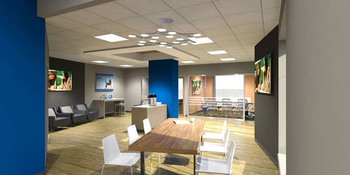
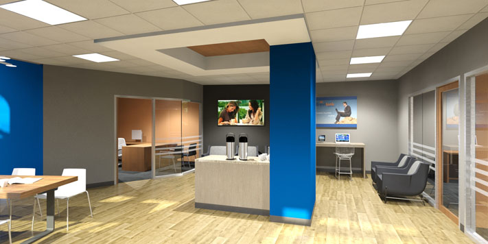
The Royal Bank was also rebranding, so the design team incorporated the new logo and color scheme into the design of the Midtown Branch. They used the bank’s signature colors on accent walls and furniture upholstery, which created a cohesive and visually appealing environment. The new logo was also incorporated into signage and digital displays, reinforcing the bank’s brand presence and establishing a sense of trust and familiarity among customers.
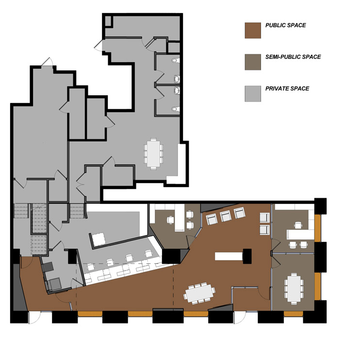
Improving the overall customer experience was a key objective of the project, so the design-build team prioritized enhancing visibility within the branch. They repositioned the front entryway and strategically placed teller stations and offices. This resulted in a more open and welcoming atmosphere. Customers entering the branch are now greeted with a clear line of sight to all service areas, making navigation easier and reducing any potential confusion. The open layout promotes transparency and accessibility, fostering stronger connections between customers and bank staff.
Recognizing the importance of efficient back-end operations, the design-build team allocated additional space for the tellers’ administrative tasks and storage. This optimization ensured that the branch could effectively support the operational needs of the teller staff. By expanding the “back of house” areas, workflow and productivity were improved, resulting in a smoother and more efficient experience for both customers and employees.
Understanding the significance of community engagement, the design-build team incorporated a dedicated community space within the Midtown Branch. This versatile area serves as a gathering place for customers, providing a platform for events, workshops, and educational sessions. The design of the community space reflects the bank’s commitment to fostering strong relationships with the local community. Comfortable seating, flexible furniture arrangements, and state-of-the-art audiovisual equipment create an inviting and functional space that can adapt to various activities and gatherings.
The proposed tenant improvement project for the Midtown Branch successfully integrated efficiency, brand identity, and customer-centric design. The redesigned teller line improved operational flow and enhanced the customer experience, while the incorporation of the new logo and color scheme created a visually cohesive environment. The increased visibility and openness, coupled with optimized back-of-house spaces, ensured a seamless and efficient banking experience for both customers and employees. The addition of a dedicated community space further underscored the bank’s commitment to fostering connections and supporting the local community. With this comprehensive improvement, the Midtown Branch is poised to serve as a modern and inviting banking destination that reflects the values and aspirations of the Royal Bank.
